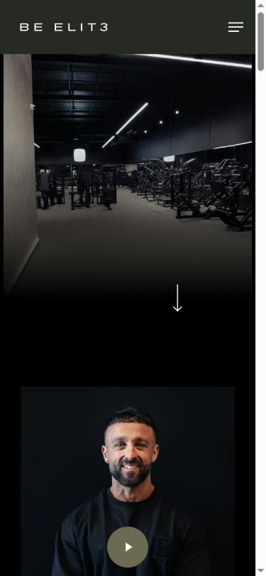
Premium gyms sell a feeling. The website had to deliver it in three seconds.
Be Elit3 isn't a 24-hour franchise. It's a high-performance training community with expert coaches, small groups and a results-first culture — and it charges accordingly. The website had to communicate that standard instantly, to someone scrolling on their phone, without a wall of text or a single stock image of a smiling model on a treadmill.
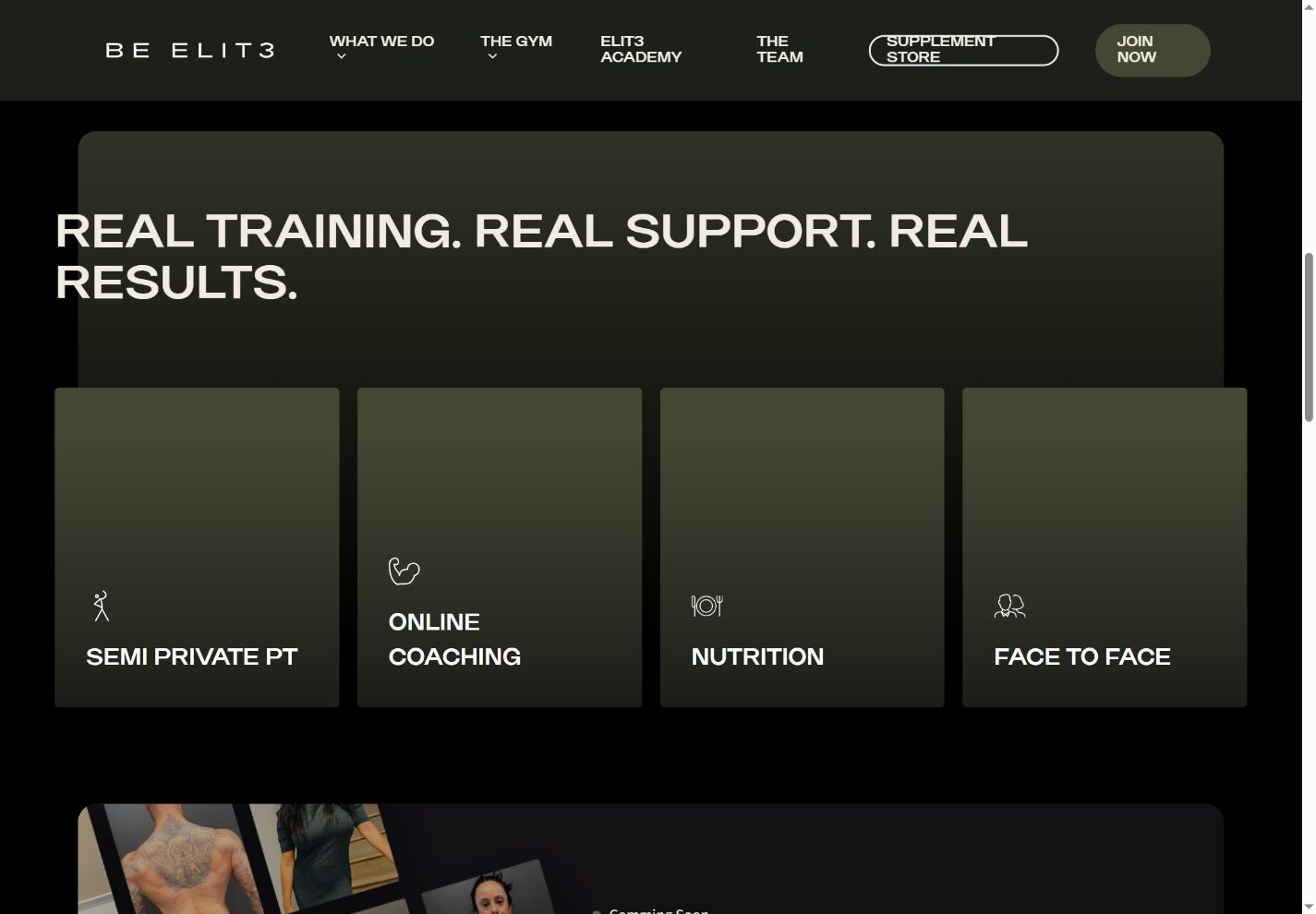
It also had to sell four quite different offers — semi-private classes, online coaching, face-to-face PT and nutrition — plus an academy, a recurring challenge and a separate supplement store, without feeling like a menu. One brand, one tone, one clear path to "Join Now", whichever door someone came through.
Lead with motion. Strip back the noise. Make joining the obvious move.
Design the experience around video
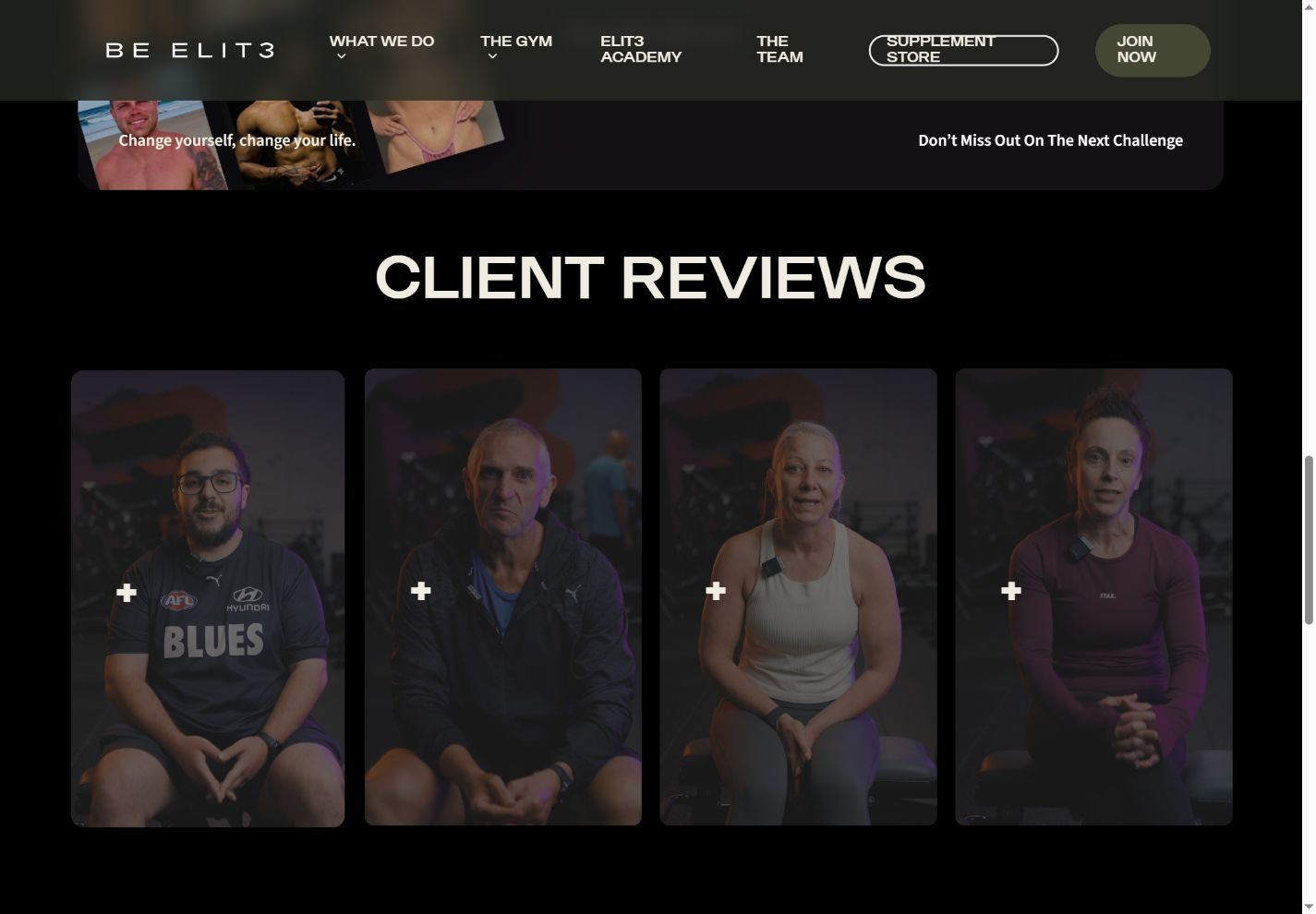
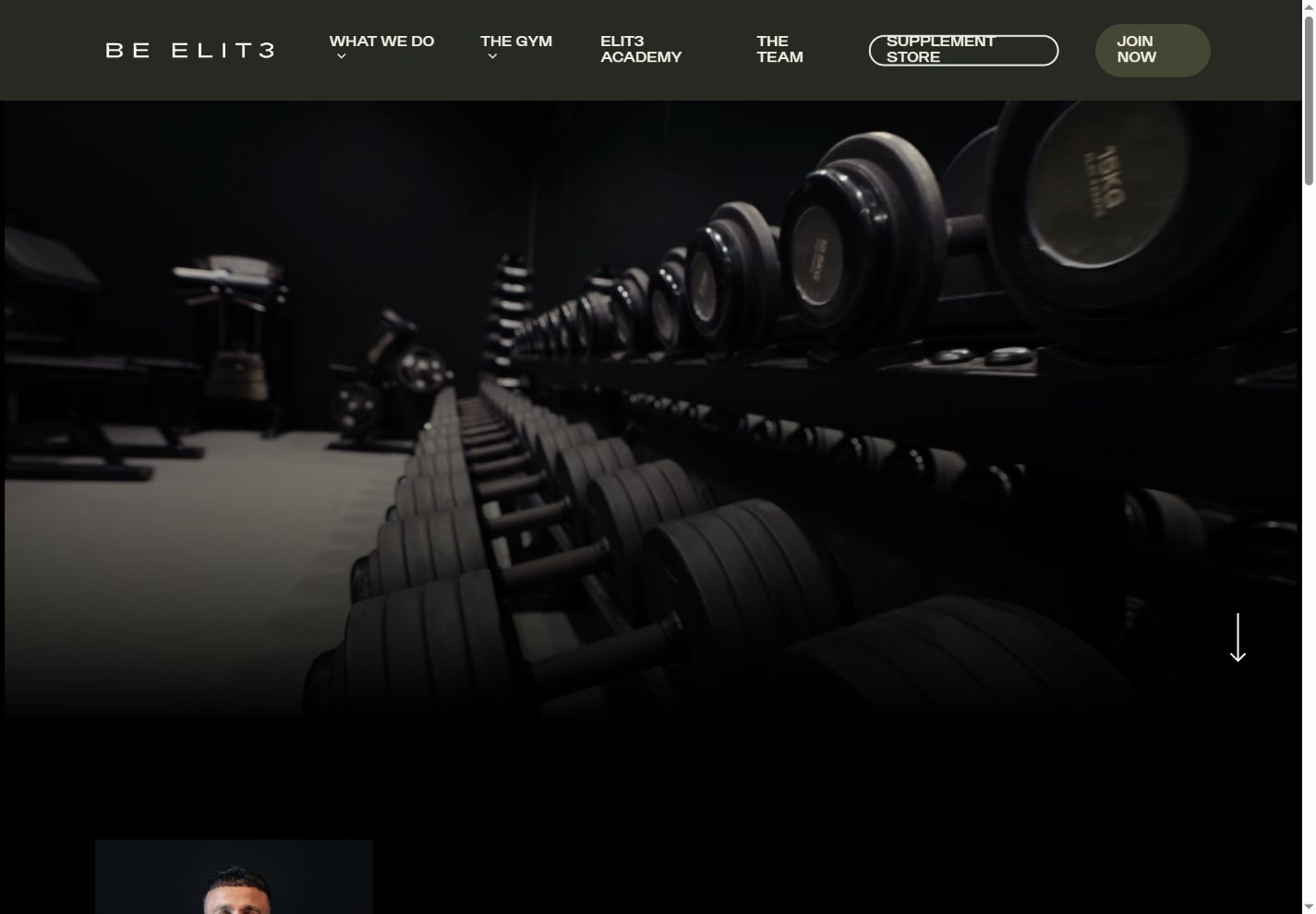
A full-screen cinematic video hero, a brand film and video client reviews. The site shows the club, the coaches and the results instead of describing them — the fastest way to communicate premium on a phone.
Build the UI for a premium brand
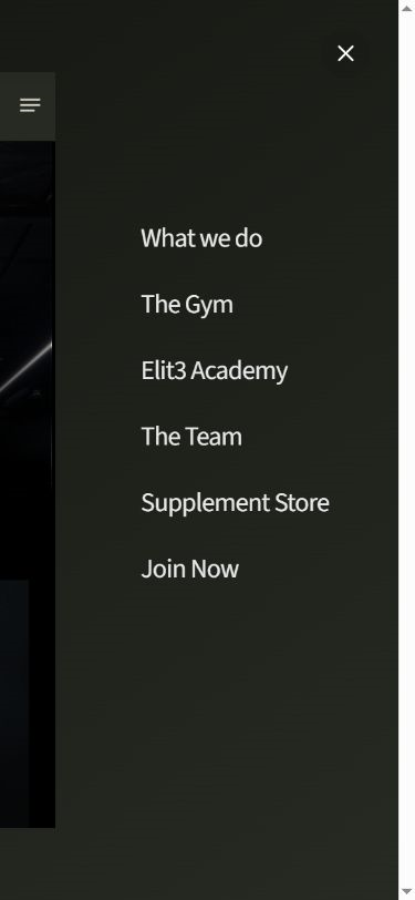
Dark, high-contrast, generous spacing, restrained typography and a slide-out menu. Every element designed to carry the existing Be Elit3 identity with the confidence of a luxury brand, not a fitness template.
Structure four offers as one journey
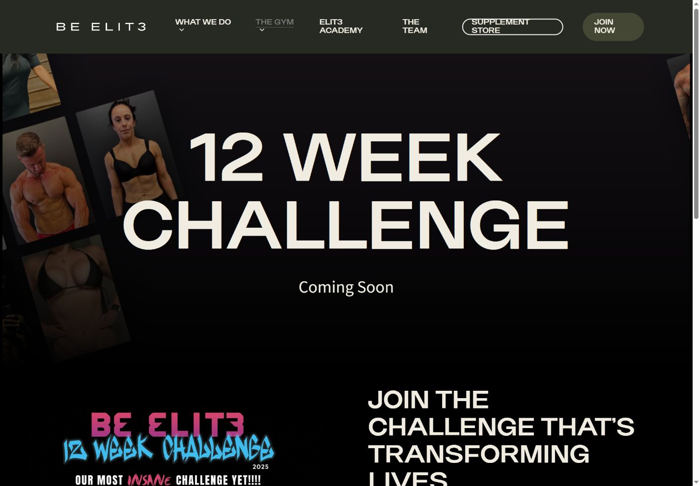
What We Do with anchored sections for Classes, Online Coaching and Face to Face; The Gym with the 12 Week Challenge; Elit3 Academy; The Team. Clear, shallow navigation so no visitor is more than one tap from the offer that fits them.
Make proof unavoidable
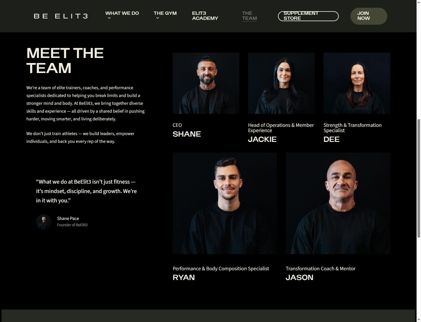
Real member transformations as video testimonials, the team as named coaches with faces, the challenge as a live, recurring event — social proof woven through the flow rather than parked on a page.
Build it mobile-first on custom WordPress
A fully custom WordPress build the Be Elit3 team can update themselves: swap the hero film, add a coach, launch the next challenge, update classes — no developer needed between campaigns.
 WordPress