
An audience was already waiting. The brand had to be worth it.
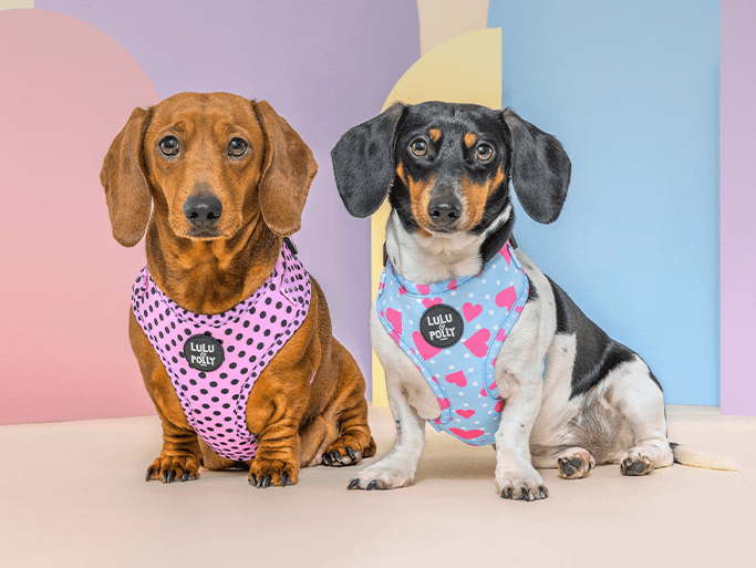
The Instagram following existed before the business did. That's a head start most startups would kill for — and a risk. The moment Lulu & Polly launched products, the brand had to look as considered and lovable as the dogs people had been following, or the goodwill would evaporate on the first visit to the site.
Everything had to be created from zero: an identity with real personality, a logo system that worked from a harness tag to a website header, and a store that could hold 35 products and grow — all for a first-time founder who needed to run it herself after launch.
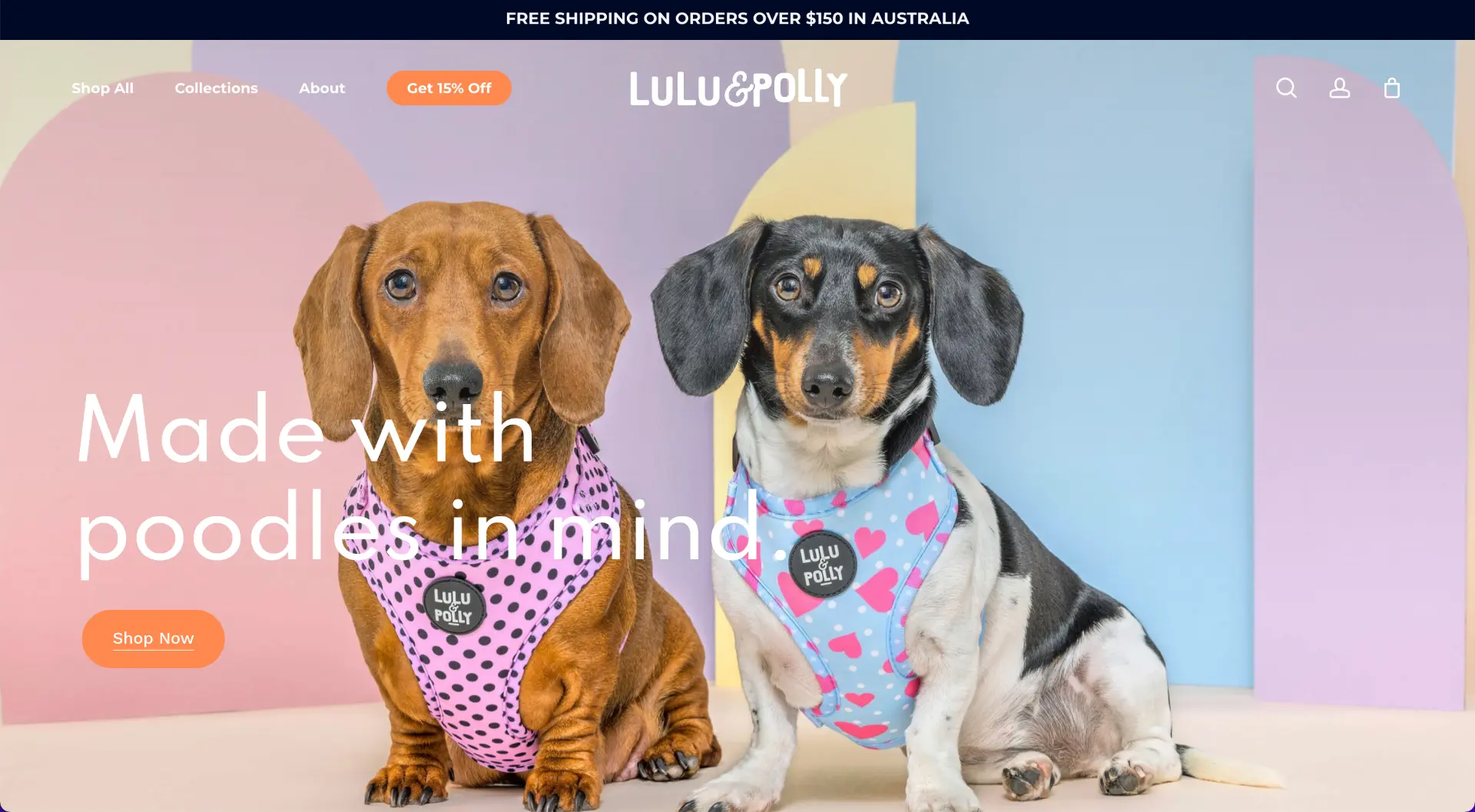
Understand the personalities. Build the brand. Open the store.
Get to know the brand's personality
We sat down with the owner and worked out who Lulu & Polly actually are — bold but soft, playful but premium — before a single mark was drawn.
Explore identity variations
Multiple branding directions developed from that understanding, refined with the client to the one that fit best.
Lock the colour system
Black and white for strength and clarity, hot pink #f850a2 for the flair. Simple enough to be unmistakable on a product, a post or a parcel.
Design the wordmark and symbol
A primary wordmark for the majority of branding and a compact symbol for icons, tags and small-format use — plus email signatures so the brand showed up in every inbox.
Design and build the store
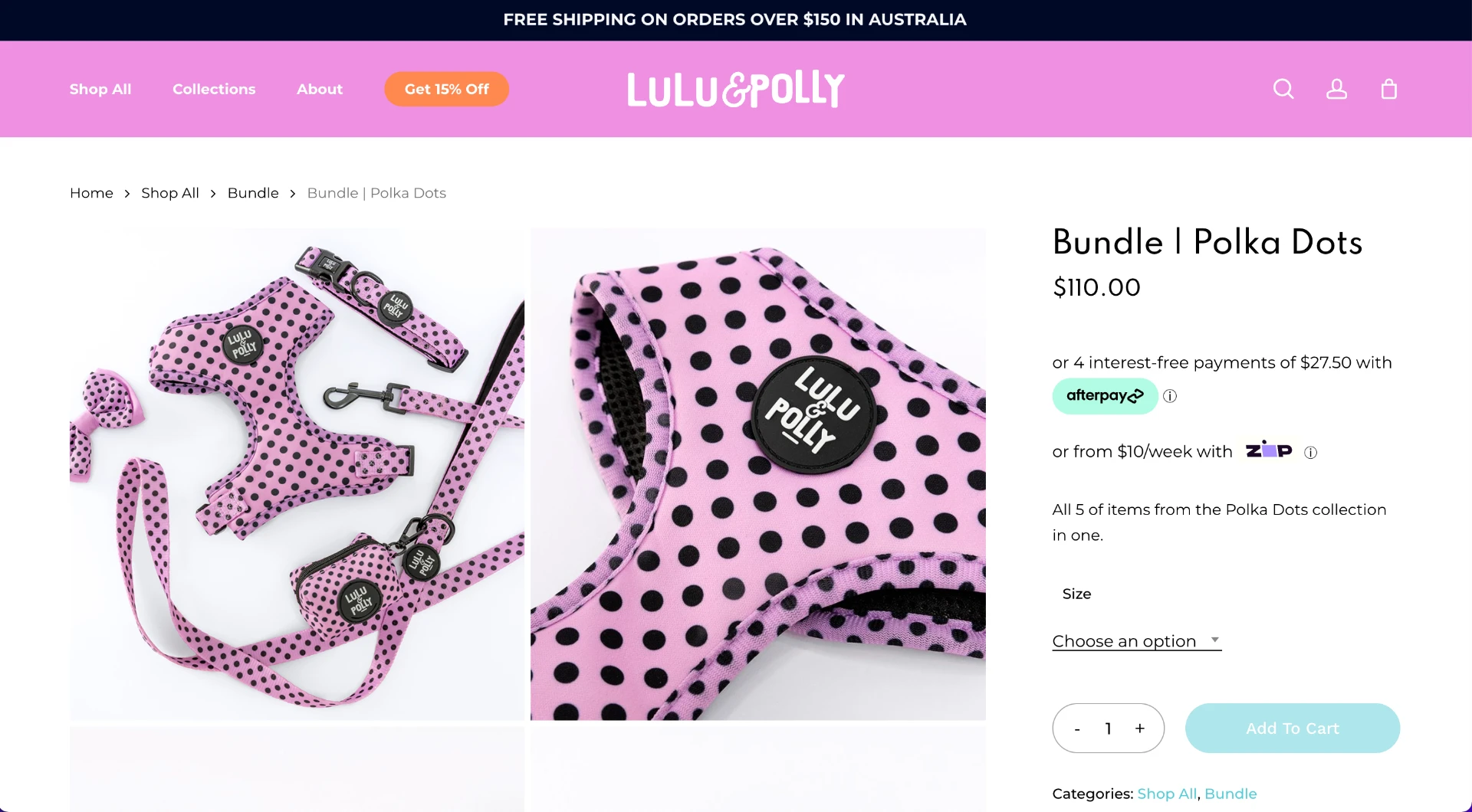
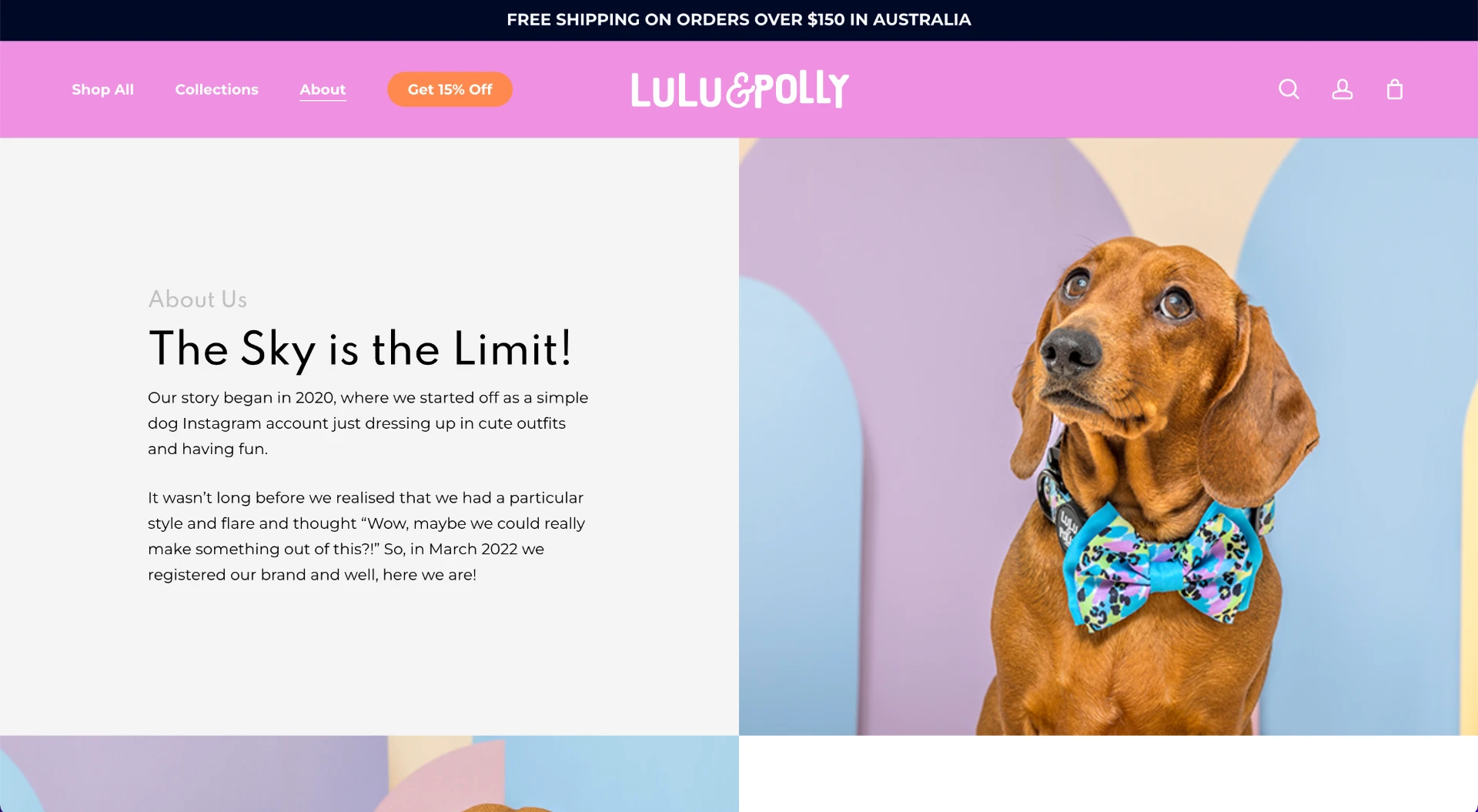
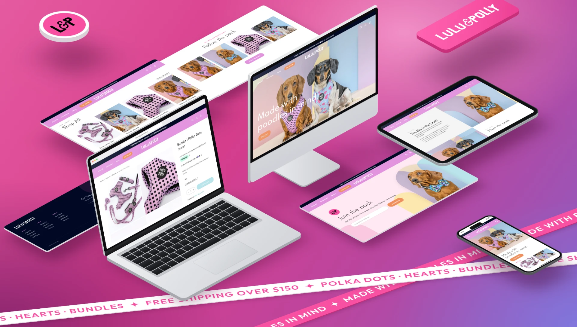
Layout, colour and imagery chosen so Lulu and Polly's personalities carry through every page, on a fully responsive WooCommerce platform organised for 35 products and built to grow.
Lulu & Polly is a strong brand with a gentle touch. Black and white bring the boldness; hot pink brings the flair.
 WordPress
 WooCommerce